Color can only exist when three components are present: a viewer, an object, and light. Although pure white light is perceived as colorless, it actually contains all colors in the visible spectrum. When white light hits an object, it selectively blocks some colors and reflects others; only the reflected colors contribute to the viewer's perception of color.
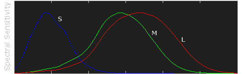
The human eye senses this spectrum using a combination of rod and cone cells for vision. Rod cells are better for low-light vision, but can only sense the intensity of light, whereas whilecone cells can also discern color, they function best in bright light.
Note how each type of cell does not just sense one color, but instead has varying degrees of sensitivity across a broad range of wavelengths. Move your mouse over "luminosity" to see which colors contribute the most towards our perception of brightness. Also note how human color perception is most sensitive to light in the yellow-green region of the spectrum; this is utilized by the bayer array in modern digital cameras.
Virtually all our visible colors can be produced by utilizing some combination of the three primary colors, either by additive or subtractive processes. Additive processes create color by adding light to a dark background, whereas subtractive processes use pigments or dyes to selectively block white light. A proper understanding of each of these processes creates the basis for understanding color reproduction.
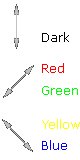
The color in the three outer circles are termed primary colors, and are different in each of the above diagrams. Devices which use these primary colors can produce the maximum range of color. Monitors release light to produce additive colors, whereas printers use pigments or dyes to absorb light and create subtractive colors. This is why nearly all monitors use a combination of red, green and blue (RGB) pixels, whereas most color printers use at least cyan, magenta and yellow (CMY) inks. Many printers also include black ink in addition to cyan, magenta and yellow (CMYK) because CMY alone cannot produce deep enough shadows.
Subtractive processes are more susceptible to changes in ambient light, because this light is what becomes selectively blocked to produce all their colors. This is why printed color processes require a specific type of ambient lighting in order to accurately depict colors.
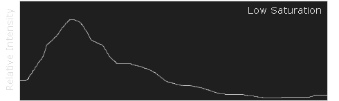
Color has two unique components that set it apart from achromatic light: hue and saturation. Visually describing a color based on each of these terms can be highly subjective, however each can be more objectively illustrated by inspecting the light's color spectrum.
Naturally occurring colors are not just light at one wavelength, but actually contain a whole range of wavelengths. A color's "hue" describes which wavelength appears to be most dominant. The object whose spectrum is shown below would likely be perceived as bluish, even though it contains wavelengths throughout the spectrum.
Although this spectrum's maximum happens to occur in the same region as the object's hue, it is not a requirement. If this object instead had separate and pronounced peaks in just the the red and green regions, then its hue would instead be yellow (see the additive color mixing table).
OVERVIEW OF COLOR MANAGEMENT
色彩管理概述
"Color management" is a process where the color characteristics for every device in the imaging chain is known precisely and utilized in color reproduction. It often occurs behind the scenes and doesn't require any intervention, but when color problems arise, understanding this process can be critical.
In digital photography, this imaging chain usually starts with the camera and concludes with the final print, and may include a display device in between:
Many other imaging chains exist, but in general, any device which attempts to reproduce color can benefit from color management. For example, with photography it is often critical that your prints or online gallery appear how they were intended. Color management cannot guarantee identical color reproduction, as this is rarely possible, but it can at least give you more control over any changes which may occur.
THE NEED FOR PROFILES & REFERENCE COLORS
Color reproduction has a fundamental problem: a given "color number" doesn't necessarily produce the same color in all devices. We use an example of spiciness to convey both why this creates a problem, and how it is managed.
Let's say that you're at a restaurant and are about to order a spicy dish. Although you enjoy spiciness, your taste buds are quite sensitive, so you want to be careful that you specify a pleasurable amount. The dilemma is this: simply saying "medium" might convey one level of spice to a cook in Thailand, and a completely different level to someone from England. Restaurants could standardize this based on the number of peppers included in the dish, but this alone wouldn't be sufficient. Spice also depends on how sensitive the taster is to each pepper:

To solve your spiciness dilemma, you could undergo a one-time taste test where you eat a series of dishes, with each containing slightly more peppers (shown above). You could then create a personalized table to carry with you at restaurants which specifies that 3 equals "mild," 5 equals "medium," and so on (assuming that all peppers are the same). Next time, when you visit a restaurant and say "medium," the waiter could look at your personal table and translate this into a standardized concentration of peppers. This waiter could then go to the cook and say to make the dish "extra mild," knowing all too well what this concentration of peppers would actually mean to the cook.
As a whole, this process involved (1) characterizing each person's sensitivity to spice, (2)standardizing this spice based on a concentration of peppers and (3) being able to collectively use this information to translate the "medium" value from one person into an "extra mild" value for another. These same three principles are used to manage color.
COLOR PROFILES
A device's color response is characterized similar to how the personalized spiciness table was created in the above example. Various numbers are sent to this device, and its output is measured in each instance:
| Input Number (Green) |
|
Output Color |
| Device 1 |
Device 2 |
| 200 |
→ |
|
|
| 150 |
→ |
|
|
| 100 |
→ |
|
|
| 50 |
→ |
|
|
Real-world color profiles include all three colors, more values, and are usually more sophisticated than the above table — but the same core principles apply. However, just as with the spiciness example, a profile on its own is insufficient. These profiles have to be recorded in relation to standardized reference colors, and you need color-aware software that can use these profiles to translate color between devices.
COLOR MANAGEMENT OVERVIEW
Putting it all together, the following diagram shows how these concepts might apply when converting color between a display device and a printer:
 |
|
 |
Characterized
Input Device |
|
Standardized
Profile Connection Space |
|
Characterized
Output Device |

RGB
Color Profile
(color space) |
 |
 |
|

CMYK
Color Profile
(color space) |
- Characterize. Every color-managed device requires a personalized table, or "color profile," which characterizes the color response of that particular device.
- Standardize. Each color profile describes these colors relative to a standardized set of reference colors (the "Profile Connection Space").
- Translate. Color-managed software then uses these standardized profiles to translate color from one device to another. This is usually performed by a color management module (CMM).
The above color management system was standardized by the International Color Consortium (ICC), and is now used in most computers. It involves several key concepts: color profiles (discussed above), color spaces, and translation between color spaces.
Color Space. This is just a way of referring to the collection of colors/shades that are described by a particular color profile. Put another way, it describes the set of all realizable color combinations. Color spaces are therefore useful tools for understanding the color compatibility between two different devices. See the tutorial on color spaces for more on this topic.
Profile Connection Space (PCS). This is a color space that serves as a standardized reference (a "reference space"), since it is independent of any particular device's characteristics. The PCS is usually the set of all visible colors defined by the Commission International de l'éclairage (CIE) and used by the ICC.
Note: The thin trapezoidal region drawn within the PCS is what is called a "working space." The working space is used in image editing programs (such as Adobe Photoshop), and defines the subset of colors available to work with when performing any image editing.
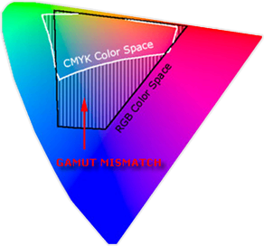
Color Translation. The color management module (CMM) is the workhorse of color management, and is what performs all the calculations needed to translate from one color space into another. Contrary to previous examples, this is rarely a clean and simple process. For example, what if the printer weren't capable of producing as intense a color as the display device? This is called a "gamut mismatch," and would mean that accurate reproduction is impossible. In such cases the CMM therefore just has to aim for the best approximation that it can. See the tutorial on color space conversion for more on this topic.
A "color space" is a useful conceptual tool for understanding the color capabilities of a particular device or digital file. When trying to reproduce color on another device, color spaces can show whether you will be able to retain shadow/highlight detail, color saturation, and by how much either will be compromised.
Colour Space
色彩空间
THE DIGITAL COLOR PALETTE
Similar to how an artist might mix their primary colors on a palette in order to visualize the range of colors/shades they have to draw from, a color space is effectively just a digital palette — except these colors are much more precisely organized and quantified.

above palette photo is a modified version of the original by tibchris
However, unlike with an artist's palette, color spaces often remain unseen and serve only as backdrops for behind the scenes calculations. Even so, learning to visualize them can help you to identify the most suitable color space for a given task.
VISUALIZING COLOR SPACES
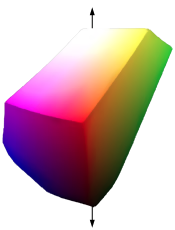
A color space relates numbers to actual colors, and is a three-dimensional object which contains all realizable color combinations. Similar to how one would organize a paint palette, each direction in "color space" often represents some aspect of color, such as lightness,saturation or hue (depending on the type of space).
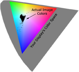
The two diagrams below show the outer surface of a sample color space from two different viewing angles. This surface represents the most extreme colors which are reproducible within this particular color space (the "color gamut"). Everything inside the color space is therefore a more subtle combination of the colors shown on the surface.
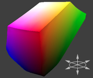
Sample Color Space
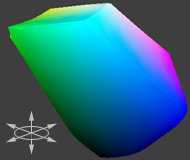
(Same Space Rotated 180°)
The above diagram is intended to help you qualitatively understand and visualize a color space, however it would not be very useful for real-world color management. This is because a color space almost always needs to be compared to another space.
COMPARING COLOR SPACES
In order to visualize more than one color space at a time, color spaces are often represented using two-dimensional slices from their full 3D shape. These are more useful for everyday purposes, because they allow you to quickly see the entire boundary of a given cross-section. Unless specified otherwise, two-dimensional diagrams usually show the cross-section containing all colors which are at 50% luminance (a horizontal slice at the vertical midpoint for the color space shown above).
 2D Color Space Comparison
(Colors at 50% Luminance)
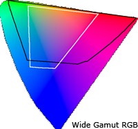
The diagram to the right compares three color spaces at once: sRGB, Wide Gamut RGB, and a device-independent reference space. sRGB and Wide Gamut RGB are two working spaces sometimes used for image editing.
What can we infer from a 2D color space comparison? Both the black and white outlines show the colors which are reproducible by each color space, as a subset of some reference space. Colors shown in the reference color space are only for qualitative visualization, as these depend on how your display device renders color. In addition, the reference space almost always contains more colors than can be shown on a computer display.
For this particular diagram, we see that the "Wide Gamut RGB" color space contains more extreme reds, purples, and greens, whereas the "sRGB" color space contains slightly more blues. Keep in mind that this analysis only applies for colors at 50% luminance, which is what occupies the midtones of an image histogram. If we were interested in the color gamut for the shadows or highlights, for example, we could instead look at a 2D cross-section of the color space at roughly 25% and 75% luminance, respectively.
TYPES: DEVICE DEPENDENT & WORKING SPACES
Color spaces have many different types and applications. Common terminology includes:
- Device-dependent spaces express color relative to some other reference space. These can tell you valuable information about the subset of colors which can be displayed using a particular monitor or printer, or can be captured using a particular digital camera or scanner.
- Device-independent spaces express color in absolute terms. These often serve as universal reference colors, so they're useful as a backdrop for comparing other devices. Otherwise these are usually an unseen color space, since they're knowingly interacted with during the photo editing process only rarely.
- Working spaces are used by image editing programs and file formats to constrain the range of colors to a standard palette. Two of the most commonly used working spaces in digital photography are Adobe RGB 1998 and sRGB IEC61966-2.1. For an in-depth comparison for each of these color spaces, please see sRGB vs. Adobe RGB 1998.
Devices or working spaces that can realize more extreme colors are said to have a "wide gamut," whereas the opposite is true for "narrow gamut" color spaces.
REFERENCE SPACES
What was the reference space that was shown in the earlier comparison? Nearly all color management software today uses a device-independent space defined by the Commission International de l' éclairage (CIE) in 1931. This space aims to describe all colors visible to the human eye based upon the average response from a set of people with no vision problems (termed a "standard colorimetric ").
Note: Virtually all devices are subsets of the visible colors specified by the CIE (including your display device), and so any representation of this space on a monitor should be taken as qualitative and highly inaccurate.
The CIE space of visible color is expressed in several common forms: CIE xyz (1931), CIE L*a*b*, and CIE L u'v' (1976). Each contains the same colors, however they differ in how they distribute color onto a two-dimensional space:
(All color spaces shown are 2D cross-sections at 50% Luminance)
CIE xyz is based on a direct graph of the signals from each of the three types of color sensors in the human eye. These are also referred to as the X, Y and Z tristimulus functions (that were created in 1931). However, this representation allocates too much area to the greens — confining most of the apparent color variation to a small area.
CIE L u'v' was created to correct for the CIE xyzdistortion by distributing colors roughly proportional to their perceived color difference. A region that is twice as large in u'v' will therefore also appear to have twice the color diversity — making it far more useful for visualizing and comparing different color spaces.
CIE L*a*b* remaps the visible colors so that they extend equally on two axes — conveniently filling a square. Each axis in the L*a*b* color space also represents an easily recognizable property of color, such as the red-green and blue-yellow shifts (used in the 3D visualization at the start of this tutorial). These traits make L*a*b* a useful color space for editing digital images, such as with Adobe Photoshop, GIMP, etc.
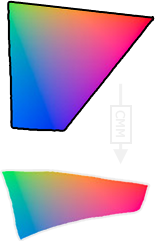
COLOR SPACE CONVERSION
色彩空间转换
Color space conversion is what happens when a color management module (CMM) translates color from one device's space to another. Conversion may require approximations in order to preserve the image's most important color qualities. Knowing how these approximations work can help you control how the photo may change — hopefully maintaining the intended look or mood.
| Input Device |
|
Profile Connection Space |
|
Output Device |
RGB Profile
(RGB Space) |
 |
|
|
CMYK Profile
(CMYK Space) |
BACKGROUND: GAMUT MISMATCH & RENDERING INTENT
The translation stage attempts to create a best match between devices — even when seemingly incompatible. If the original device has a larger color gamut than the final device, some of the those colors will be outside the final device's color space. These "out-of-gamut colors" occur with nearly every conversion and are called a gamut mismatch.
| RGB Color Space |
|
 |
|---|
 |
CMYK Color Space
(Destination Space) |
|---|
Each time a gamut mismatch occurs, the CMM uses the rendering intent to decide what qualities of the image it should prioritize. Common rendering intents include: absolute and relative colorimetric, perceptual, and saturation. Each of these types maintains one property of color at the expense of others (described below).
PERCEPTUAL & RELATIVE COLORIMETRIC INTENT
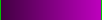
Perceptual and relative colorimetric rendering are probably the most useful conversion types for digital photography. Each places a different priority on how they render colors within the gamut mismatch region. Relative colorimetric maintains a near exact relationship between in gamut colors, even if this clips out of gamut colors. In contrast, perceptual rendering tries to also preserve some relationship between out of gamut colors, even if this results in inaccuracies for in gamut colors. The following example demonstrates an extreme case for an image within a 1-D black-magenta color space:
| Original Image: |
A = Wide Gamut Space
B = Narrow Gamut Space
(Destination Space) |
 |
|
| |
Relative Colorimetric |
|
Perceptual |
|---|
| A |
 |
|
| ↓ |
 |
 |
| B |
 |
|
| |
Converted Image: |
Converted Image: |
 |
 |
Note how perceptual maintains smooth color gradations throughout by compressing the entire tonal range, whereas relative colorimetric clips out of gamut colors (at center of magenta globules and in the darkness between them). For 2D and 3D color spaces, relative colorimetric maps these to the closest reproducible hue in the destination space.
Even though perceptual rendering compresses the entire gamut, note how it remaps the central tones more precisely than those at the edges of the gamut. The exact conversion depends on what CMM is used for the conversion; Adobe ACE, Microsoft ICM and Apple ColorSynch are some of the most common.
Another distinction is that perceptual does not destroy any color information — it just redistributes it. Relative colorimetric, on the other hand, does destroy color information. This means that conversion using relative colorimetric intent is irreversible, while perceptual can be reversed. This is not to say that converting from space A to B and then back to A again using perceptual will reproduce the original; this would require careful use of tone curves to reverse the color compression caused by the conversion.
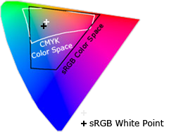
ABSOLUTE COLORIMETRIC INTENT
Absolute is similar to relative colorimetric in that it preserves in gamut colors and clips those out of gamut, but they differ in how each handles the white point. The white point is the location of the purest and lightest white in a color space (also see discussion of color temperature). If one were to draw a line between the white and black points, this would pass through the most neutral colors.
|
|
|
 |
| 3D Color Space |
|
2D Cross-Section
(Two Spaces at 50% Luminosity) |
The location of this line often changes between color spaces, as shown by the "+" on the top right. Relative colorimetric skews the colors within gamut so that the white point of one space aligns with that of the other, while absolute colorimetric preserves colors exactly (without regard to changing white point). To illustrate this, the example below shows two theoretical spaces that have identical gamuts, but different white points:
 = White Point = White Point |
|
|
|
|
|
|
Conversion
→
from #1 to #2 |
|
 |
| Color Space #1 |
Color Space #2 |
|
Absolute
Colorimetric |
Relative
Colorimetric |
Absolute colorimetric preserves the white point, while relative colorimetric actually displaces the colors so that the old white point aligns with the new one (while still retaining the colors' relative positions). The exact preservation of colors may sound appealing, however relative colorimetric adjusts the white point for a reason. Without this adjustment, absolute colorimetric results in unsightly image color shifts, and is thus rarely of interest to photographers.
This color shift results because the white point of the color space usually needs to align with that of the light source or paper tint used. If one were printing to a color space for paper with a bluish tint, absolute colorimetric would ignore this tint change. Relative colorimetric would compensate colors to account for the fact that the whitest and lightest point has a tint of blue.
SATURATION INTENT
Saturation rendering intent tries to preserve saturated colors, and is most useful when trying to retain color purity in computer graphics when converting into a larger color space. If the original RGB device contained pure (fully saturated) colors, then saturation intent ensures that those colors will remain saturated in the new color space — even if this causes the colors to become relatively more extreme.
| Pie chart with fully saturated cyan,blue, magenta and red: |
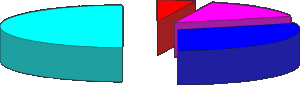 |
Saturation intent is not desirable for photos because it does not attempt to maintain color realism. Maintaining color saturation may come at the expense of changes in hue and lightness, which is usually an unacceptable trade-off for photo reproduction. On the other hand, this is often acceptable for computer graphics such as pie charts.
Another use for saturation intent is to avoid visible dithering when printing computer graphics on inkjet printers. Some dithering may be unavoidable as inkjet printers never have an ink to match every color, however saturation intent can minimize those cases where dithering is sparse because the color is very close to being pure.
| Visible dithering due to lack of fully saturated colors: |
 |
PAY ATTENTION TO IMAGE CONTENT
One must take the range of image colors present into account; just because an image is defined by a large color space does not mean that it actually utilizes all of those extreme colors. If the destination color space fully encompasses the image's colors (despite being smaller than the original space), then relative colorimetric will yield a more accurate result.
Example Image:
 |
 |
The above image barely utilizes the gamut of your computer display device, which is actually typical of many photographic images. If one were to convert the above image into a destination space which had less saturated reds and greens, this would not place any image colors outside the destination space. For such cases, relative colorimetric would yield more accurate results. This is because perceptual intent compresses the entire color gamut — regardless of whether these colors are actually utilized.
SHADOW & HIGHLIGHT DETAIL IN 3D COLOR SPACES
Real-world photographs utilize three-dimensional color spaces, even though up until now we have been primarily analyzing spaces in one and two dimensions. The most important consequence of rendering intent on 3D color spaces is how it affects shadow and highlight detail.
If the destination space can no longer reproduce subtle dark tones and highlights, this detail may be clipped when using relative/absolute colorimetric intent. Perceptual intent compresses these dark and light tones to fit within the new space, however it does this at the cost of reducing overall contrast (relative to what would have been produced with colorimetric intent).
The conversion difference between perceptual and relative colorimetric is similar to what was demonstrated earlier with the magenta image. The main difference is that now the compression or clipping occurs in the vertical dimension — for shadows and highlight colors. Most prints cannot produce the range of light to dark that we may see on our computer display, so this aspect is of particular importance when making a print of a digital photograph.
Using the "black point compensation" setting can help avoid shadow clipping — even with absolute and relative colorimetric intents. This is available in the conversion properties of nearly all software which supports color management (such as Adobe Photoshop).
RECOMMENDATIONS
So which is the best rendering intent for digital photography? In general, perceptual and relative colorimetric are best suited for photography because they aim to preserve the same visual appearance as the original.
The decision about when to use each of these depends on image content and the intended purpose. Images with intense colors (such as bright sunsets or well-lit floral arrangements) will preserve more of their color gradation in extreme colors using perceptual intent. On the other hand, this may come at the expense of compressing or dulling more moderate colors. Images with more subtle tones (such as some portraits) often stand to benefit more from the increased accuracy of relative colorimetric (assuming no colors are placed within the gamut mismatch region). Perceptual intent is overall the safest bet for general and batch use, unless you know specifics about each image.
UNDERSTANDING GAMMA CORRECTION
GAMMA校正
Gamma is an important but seldom understood characteristic of virtually all digital imaging systems. It defines the relationship between a pixel's numerical value and its actual luminance. Without gamma, shades captured by digital cameras wouldn't appear as they did to our eyes (on a standard monitor). It's also referred to as gamma correction, gamma encoding or gamma compression, but these all refer to a similar concept. Understanding how gamma works can improve one's exposure technique, in addition to helping one make the most of image editing.
WHY GAMMA IS USEFUL
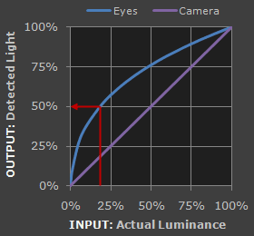
1. Our eyes do not perceive light the way cameras do. With a digital camera, when twice the number of photons hit the sensor, it receives twice the signal (a "linear" relationship). Pretty logical, right? That's not how our eyes work. Instead, we perceive twice the light as being only a fraction brighter — and increasingly so for higher light intensities (a "nonlinear" relationship).
Compared to a camera, we are much more sensitive to changes in dark tones than we are to similar changes in bright tones. There's a biological reason for this peculiarity: it enables our vision to operate over a broader range of luminance. Otherwise the typical range in brightness we encounter outdoors would be too overwhelming.
But how does all of this relate to gamma? In this case, gamma is what translates between our eye's light sensitivity and that of the camera. When a digital image is saved, it's therefore "gamma encoded" — so that twice the value in a file more closely corresponds to what we would perceive as being twice as bright.
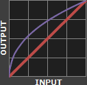
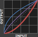
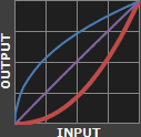
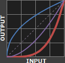
Technical Note: Gamma is defined by Vout = Vingamma , where Vout is the output luminance value and Vin is the input/actual luminance value. This formula causes the blue line above to curve. When gamma<1, the line arches upward, whereas the opposite occurs with gamma>1.
2. Gamma encoded images store tones more efficiently. Since gamma encoding redistributes tonal levels closer to how our eyes perceive them, fewer bits are needed to describe a given tonal range. Otherwise, an excess of bits would be devoted to describe the brighter tones (where the camera is relatively more sensitive), and a shortage of bits would be left to describe the darker tones (where the camera is relatively less sensitive):
Notice how the linear encoding uses insufficient levels to describe the dark tones — even though this leads to an excess of levels to describe the bright tones. On the other hand, the gamma encoded gradient distributes the tones roughly evenly across the entire range ("perceptually uniform"). This also ensures that subsequent image editing, color andhistograms are all based on natural, perceptually uniform tones.
However, real-world images typically have at least 256 levels (8 bits), which is enough to make tones appear smooth and continuous in a print. If linear encoding were used instead, 8X as many levels (11 bits) would've been required to avoid image posterization.
GAMMA WORKFLOW: ENCODING & CORRECTION
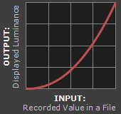
Despite all of these benefits, gamma encoding adds a layer of complexity to the whole process of recording and displaying images. The next step is where most people get confused, so take this part slowly. A gamma encoded image has to have "gamma correction" applied when it is viewed — which effectively converts it back into light from the original scene. In other words, the purpose of gamma encoding is for recording the image — not for displaying the image. Fortunately this second step (the "display gamma") is automatically performed by your monitor and video card. The following diagram illustrates how all of this fits together:
1. Image Gamma. This is applied either by your camera or RAW development software whenever a captured image is converted into a standard JPEG or TIFF file. It redistributes native camera tonal levels into ones which are more perceptually uniform, thereby making the most efficient use of a given bit depth.
2. Display Gamma. This refers to the net influence of your video card and display device, so it may in fact be comprised of several gammas. The main purpose of the display gamma is to compensate for a file's gamma — thereby ensuring that the image isn't unrealistically brightened when displayed on your screen. A higher display gamma results in a darker image with greater contrast.
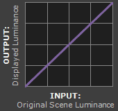
3. System Gamma. This represents the net effect of all gamma values that have been applied to an image, and is also referred to as the "viewing gamma." For faithful reproduction of a scene, this should ideally be close to a straight line (gamma = 1.0). A straight line ensures that the input (the original scene) is the same as the output (the light displayed on your screen or in a print). However, the system gamma is sometimes set slightly greater than 1.0 in order to improve contrast. This can help compensate for limitations due to the dynamic range of a display device, or due to non-ideal viewing conditions and image flare.
IMAGE FILE GAMMA
The precise image gamma is usually specified by a color profile that is embedded within the file. Most image files use an encoding gamma of 1/2.2 (such as those using sRGB and Adobe RGB 1998 color), but the big exception is with RAW files, which use a linear gamma. However, RAW image viewers typically show these presuming a standard encoding gamma of 1/2.2, since they would otherwise appear too dark:

Linear RAW Image
(image gamma = 1.0)

Gamma Encoded Image
(image gamma = 1/2.2)
If no color profile is embedded, then a standard gamma of 1/2.2 is usually assumed. Files without an embedded color profile typically include many PNG and GIF files, in addition to some JPEG images that were created using a "save for the web" setting.
Technical Note on Camera Gamma. Most digital cameras record light linearly, so their gamma is assumed to be 1.0, but near the extreme shadows and highlights this may not hold true. In that case, the file gamma may represent a combination of the encoding gamma and the camera's gamma. However, the camera's gamma is usually negligible by comparison. Camera manufacturers might also apply subtle tonal curves, which can also impact a file's gamma.
DISPLAY GAMMA
This is the gamma that you are controlling when you perform monitor calibration and adjust your contrast setting. Fortunately, the industry has converged on a standard display gamma of 2.2, so one doesn't need to worry about the pros/cons of different values. Older macintosh computers used a display gamma of 1.8, which made non-mac images appear brighter relative to a typical PC, but this is no longer the case.
Recall that the display gamma compensates for the image file's gamma, and that the net result of this compensation is the system/overall gamma. For a standard gamma encoded image file (—), changing the display gamma (—) will therefore have the following overall impact (—) on an image:
Diagrams assume that your display has been calibrated to a standard gamma of 2.2.
Recall from before that the image file gamma (—) plus the display gamma (—) equals the overall system gamma (—). Also note how higher gamma values cause the red curve to bend downward.
If you're having trouble following the above charts, don't despair! It's a good idea to first have an understanding of how tonal curves impact image brightness and contrast. Otherwise you can just look at the portrait images for a qualitative understanding.
How to interpret the charts. The first picture (far left) gets brightened substantially because the image gamma (—) is uncorrected by the display gamma (—), resulting in an overall system gamma (—) that curves upward. In the second picture, the display gamma doesn't fully correct for the image file gamma, resulting in an overall system gamma that still curves upward a little (and therefore still brightens the image slightly). In the third picture, the display gamma exactly corrects the image gamma, resulting in an overall linear system gamma. Finally, in the fourth picture the display gamma over-compensates for the image gamma, resulting in an overall system gamma that curves downward (thereby darkening the image).
The overall display gamma is actually comprised of (i) the native monitor/LCD gamma and (ii) any gamma corrections applied within the display itself or by the video card. However, the effect of each is highly dependent on the type of display device.
 |
|
 |
| CRT Monitors |
LCD (Flat Panel) Monitors |
CRT Monitors. Due to an odd bit of engineering luck, the native gamma of a CRT is 2.5 — almost the inverse of our eyes. Values from a gamma-encoded file could therefore be sent straight to the screen and they would automatically be corrected and appear nearly OK. However, a small gamma correction of ~1/1.1 needs to be applied to achieve an overall display gamma of 2.2. This is usually already set by the manufacturer's default settings, but can also be set during monitor calibration.
LCD Monitors. LCD monitors weren't so fortunate; ensuring an overall display gamma of 2.2 often requires substantial corrections, and they are also much less consistent than CRT's. LCDs therefore require something called a look-up table (LUT) in order to ensure that input values are depicted using the intended display gamma (amongst other things). See the tutorial on monitor calibration: look-up tables for more on this topic.
Technical Note: The display gamma can be a little confusing because this term is often used interchangeably with gamma correction, since it corrects for the file gamma. However, the values given for each are not always equivalent. Gamma correction is sometimes specified in terms of the encoding gamma that it aims to compensate for — not the actual gamma that is applied. For example, the actual gamma applied with a "gamma correction of 1.5" is often equal to 1/1.5, since a gamma of 1/1.5 cancels a gamma of 1.5 (1.5 * 1/1.5 = 1.0). A higher gamma correction value might therefore brighten the image (the opposite of a higher display gamma).
OTHER NOTES & FURTHER READING
Other important points and clarifications are listed below.
- Dynamic Range. In addition to ensuring the efficient use of image data, gamma encoding also actually increases the recordable dynamic range for a given bit depth. Gamma can sometimes also help a display/printer manage its limited dynamic range (compared to the original scene) by improving image contrast.
- Gamma Correction. The term "gamma correction" is really just a catch-all phrase for when gamma is applied to offset some other earlier gamma. One should therefore probably avoid using this term if the specific gamma type can be referred to instead.
- Gamma Compression & Expansion. These terms refer to situations where the gamma being applied is less than or greater than one, respectively. A file gamma could therefore be considered gamma compression, whereas a display gamma could be considered gamma expansion.
- Applicability. Strictly speaking, gamma refers to a tonal curve which follows a simple power law (where Vout = Vingamma), but it's often used to describe other tonal curves. For example, the sRGB color space is actually linear at very low luminosity, but then follows a curve at higher luminosity values. Neither the curve nor the linear region follow a standard gamma power law, but the overall gamma is approximated as 2.2.
- Is Gamma Required? No, linear gamma (RAW) images would still appear as our eyes saw them — but only if these images were shown on a linear gamma display. However, this would negate gamma's ability to efficiently record tonal levels.
For more on this topic, also visit the following tutorials:


 Additive
 Subtractive
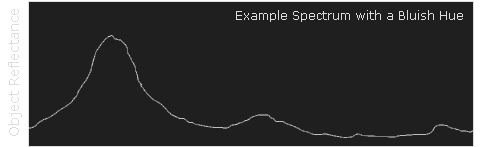

 CIE xy
 CIE a*b*
 CIE u'v'